TrustedHousesitters UX video teardown
Play the video to learn how to increase your page conversion with UX and design thinking.
In this UX teardown video we will be taking a look at Trustedhousesitters.com. TrustedHousesitters launched in 2010 with a simple mission: to keep pets happy and safe in their own homes. It was born from a real need to offer a solution to pet owners who did not want to use kennels or who just could not travel due to not having the right pet care solution. Any pet owner knows the anxiety that’s faced when planning a trip or holiday that their pets cannot accompany them on; the worries about cost and quality of care, the well being of the animals if boarding somewhere unfamiliar such as a kennels etc. This is really relevant to me, having a mini menagerie (two dogs a parrot and a snake 🙂 ) can and frequently does make holiday and travel hard. I see myself as the intended target audience for a site like this and I love applying myself to something so fitting so lets get started! I hope you enjoy the video (it is 19 minutes long) and my transcribed dictation. As always, feedback is welcomed, let me know what you think so I can improve my teardown videos in future!
What we discovered:
First up, let’s have a look at what we discovered in the video. There are some good points to mention straight off, the design of the TrustedHousesitters site is very flat and it come across stylish. I like the logo and the colour pallette (mostly) but what I think the site does best is social proof. As a marketplace that is doing well, there is loads of social proof which is amazing. The social proof really makes the most of people’s need to fall in with the majority, crowd mentality, the need to be involved too and it gets me really wanting to use it. There is a clear sense of community to the site also which is positive, encouraging people to become emotionally invested.
Top 5 things to change:
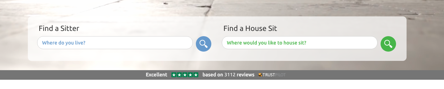
- Visibility of social proof – TrustedHousesitters use Trustpilot, which is great! It is such a valuable tool (one that I recommend anyone use where they can) but it’s quite hidden. The dark grey bar beneath the video on the home page where the Trustpilot details sit makes it almost blend in; it’s hard to see meaning users will either be squinting to read it or will miss it. That’s a missed opportunity to provide good user experience. What’s really needed is to make more of social proof and to do it higher up the page too. There is an approach and recommended page layout that factors in psychology, really tapping into how people think. Above the fold there needs to be the main value proposition and then clear social proof – so that really needs to be made more of.
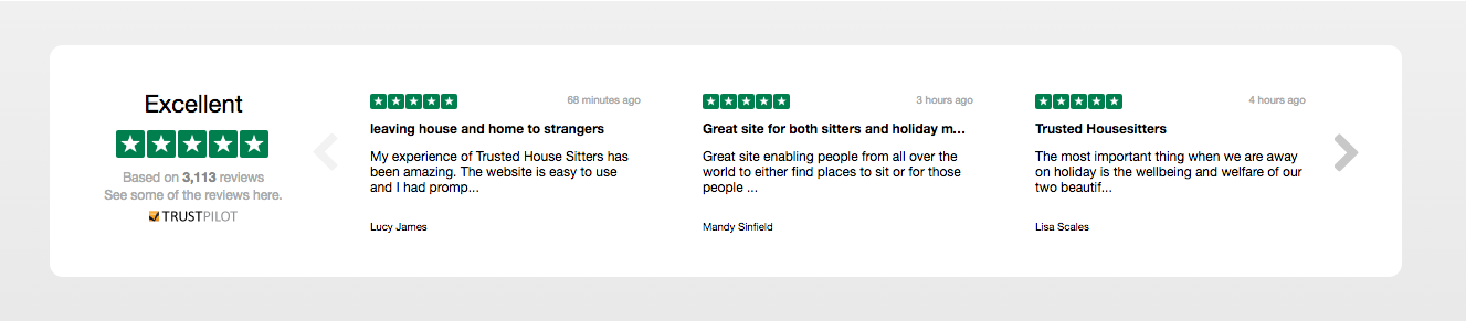
Also, further down the page, beneath the ‘Members Say’ section TrustPilot makes a repeat appearance – awesome! …But TrustPilot do many ways of hooking up data to display in different ways, and this way hides content requiring users to scroll left and right to see more reviews. The way this looks reminds me of the effect that you sometimes find on websites that feature paid advertising space heavily – the adverts often jar with the rest of the site, have different font sizes and styles etc and to me it doesn’t look polished.
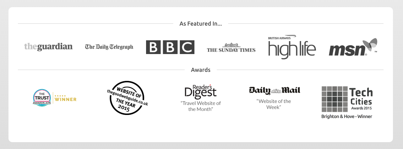
The ‘As Featured In’ section towards the bottom of the home page is good, there are some really big names there! But once more, some mention of this should be placed at the top, above the fold with other social proof.
- Page layout – I often go on about the psychology of how a page is put together – laid out in a way to so as to convert the most users. It is a fascinating topic! Obviously there are many different scenarios, situations and options as to how a page can be designed, but this is the way to display information to maximise conversion through providing any website visitor with the best possible user experience…
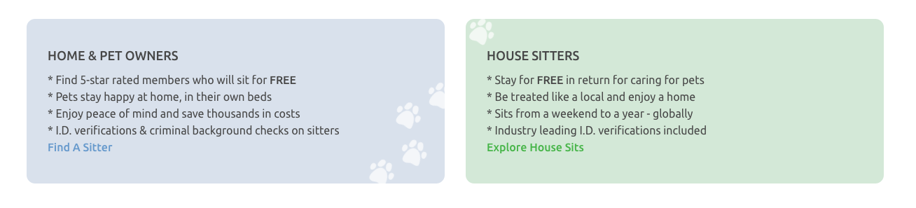
First comes the tagline or value proposition and social proof alongside logos and testimonials (ideally with relevant images – something humanising.) Then mention the problem (in this case perhaps “struggling to find some to look after your house and pets when you go away?”) Then extrapolate on that problem (does that mean that you can’t go on that dream month long trip to Australia?) Then solve the problem with benefits. TrustedHousesitters have got benefits displayed (image above,) but really first need to show the problem to then be able to solve it. Next address the problem with social proof, endorsements that the aforementioned problems are solved with the suggested solution (this is where the amazing amount of social proof that TrustedHousesitters have comes in again!) After social proof comes the need to address any objections. (Usually, any one page should adhere to one single main goal – see point 3! It is hard with any marketplace application but it really is best to keep things that way as otherwise addressing objections next becomes tricky when your having to counter potential objections for two different types of user whilst not wanting to show irrelevant information to anyone!) To address objections, it is good to have a list of FAQ’s – “how much does it cost?” “What happens if there’s a problem” etc. The thought behind overcoming objections here is that it stops users going elsewhere to try and find the answers to these potential questions, interrupting the path that we want them to take. Keeping any user engaged in the story and flow of the page, anticipating their needs and meeting them is great UX.
Keeping the page structured as described and because people prefer to scroll over having to click should focus people down the funnel to convert at the bottom of the page. It is far better to lock down a potential customer on page rather than sending them somewhere else (and also you can guarantee that your FAQ page is not set up or designed to convert as well or provide such a tailored experience as the Home page.)
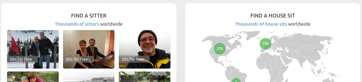
- One goal per page – Now I know that marketplace applications by nature do have it harder and have the needs of multiple types of user to meet. But trying to address 2 (or more!) goals on one page is something to avoid. In this case, how do you really effectively optimise a page when you’re dealing with a potential house sitter and potential house to sit? Every marketplace has to overcome this issue and most do what TrustedHousesitters have done, try to combine both and give each goal an equal footing and equal share of the focus on the page. That unfortunately increases cognitive load on the user which cannot provide them with the best experience.
Take a new user, arriving on the site for the for the first time. Imagine they are not particularly computer savvy, they are confronted with two options – ‘Find a sitter’ or ‘Find a house sit.’ This might sound like it wouldn’t be an issue, but we have to treat the new user as simple and basic individual who will struggle to do stuff. Anyone who owns a product will inevitably be very close to it – this will be their best asset and greatest weakness. As a product owner being so close, everything will seem so easy and straightforward through familiarity. You will need to get into a users mindset to be able to determine what is and might not be obvious to them… but bias makes that very hard indeed!
Ideally what I would suggest is needed in this situation, is to have two separate pages for ‘Find a sitter’ and ‘Find a house sit.’ The home page would give one of those of those options more prominence than the other. Obviously that would be dependant on which is of most importance to to the product owners business. The home page really does need to address one scenario or the other, otherwise there’ll be the need to double up on everything mentioned in point 2 throughout the page. This makes things more complex and uncomfortable for users. Doubling up on goals also means having to provide two CTA’s, meaning the user just has more to think about. When it comes to UX, simplicity is king. Obviously it would be ideal to run tests but TrustedHousesitters would likely see increase in conversion if the page goals were simplified.

Quickly whilst we’re on the topic of singular goals ….It’s important to only have goal per CTA too. Beneath the ‘Join Now!’ CTA there are two buttons. I understand trying to catch all users with two options but it takes time for a user to process what they’re seeing and adds confusion, ideally the gift voucher CTA would go on another page. It is more important that a user wants to click and commit here on this page, rather than giving them something else to think about. - Run tests – As mentioned in the video, if the site is receiving 25K+ visits per month, hooking up A/B testing to pit experiments against one another would be the best thing. It’s important for a product owner, the product and the team supporting it to know if things change, is it for better or worse? As a company it allows everyone to build a picture of why there are changes being made and what that means internally. The same thinking can be applied throughout a product, as improvements are made and the understanding grows, gaps are filled in everyone’s knowledge and it’s a really happy, interesting place to be, in control of your own products destiny.

- Use the second person – Always be thinking “you” and “your” when writing text to appeal to users. Seeing “you and “your” helps users connect, so avoid “we” as seen in the H2 body text above. This thinking would need to be applied throughout the site, not just on the home page.
Top 5 quick wins:

- Remove uppercase text & consolidate fonts – In general uppercase fonts are harder to read. Using lowercase text makes it easier and reduces cognitive load on the viewer – anything to make things easier for them is good UX.
There are also lots of different sized fonts, alongside different types and styles of text. There are different colours too alongside the mix of upper and lowercase text. That’s 7 or 8 different styles in quite a small space all still above the fold of the page. The tagline/value proposition is in a font that’s quite difficult to read and that’s a lot to take in and process. Ideally there would be a better hierarchical structure of fonts for clarity and relevance. The way it is currently makes it tricky for the prospect to understand what’s happening on the page. The use of so many font and text types makes it seem cluttered or a little messy. There are only a precious few seconds to connect with a user, for the messaging on the page to resonate with them before they churn. Anything that makes understanding and connecting take longer isn’t going to be helping conversions and won’t be providing the best user experience. It’s important to note that small tweaks made together can add up to a real, marked difference


- Refine colour palette – The use of colour is something to be slightly careful of. On the home page we see quite a few different colours – pink, green, blue, another different green and the logo is a different type of green too. Subconsciously this will be adding confusion and seems un-unified. I am unsure what the main colours are. I think I would maybe remove the blue from the equation to make the site seem more together. If the green in logo is the main colour, it needs to be reflected in the other icons too. The ‘Members say…’ section is really valuable but the colours a bit muted. People prefer strong and bold colouring as muted colours put across a lack of confidence. The colours could be stronger without affecting perception of the brand.

- Improve tagline – As mentioned above marketplaces have to contend with catering to two different audiences which is always hard but the process by which an effective tagline can be created is as follows: show key benefit + timeframe + address any objections. That type of tagline resonates and converts people much more highly as it contributes towards a positive and seamless user experience culminating with the user getting exactly what they need. Obviously this can be tested and presuming there is enough traffic, A/B testing is a great idea. (Batch all little changes together and pit them against current design to see what people really respond well to.)
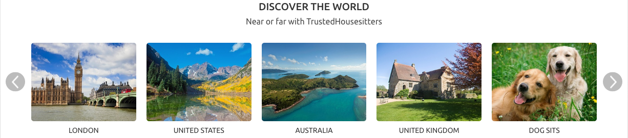
- Bring content out of carousels – Hiding content in carousels is generally frowned upon (depending on how much is hidden – in this case how many destinations there are to show.) It just means people have to click to uncover what they want to see. If you had a block of destinations, perhaps three high, people would not have to click to find locations (this is the sort of thing that I’d advise usertesting.)
- Put a CTA in the footer – This is probably the most important of all the quick wins! The user has worked down the page, becoming emotionally invested and more convinced all the way down to the bottom – That’s great! But then there’s no option for them to convert where they are. This is so important as all the hard work is done by the time the get to the bottom of the page. Improve conversions by having a big CTA there that mentions the main value proposition again.


Summary:
So, I really enjoyed taking a look at the TrustedHousesitters site and I can definitely see me using it at some point in the future. As I have said, I think their strongest asset is their social proof and sense of community but there’s always room for improvement and the points I have discussed above are only the tip of the iceberg really. When it comes to user experience it is a never ending cycle of striving making iterative changes, to constantly improve how a user experiences a product and to reap the benefits in terms conversion rates, customer satisfaction and business growth.

Brighter Mattress UX video teardown
Play the video to learn how to increase your page conversion with UX and design...