Brighter Mattress UX video teardown
Play the video to learn how to increase your page conversion with UX and design thinking.
In this video UX teardown we will be taking a look at www.brightermattress.co. Brighter spent a number of years developing “the better next day mattress.” We all know how important a good night’s sleep is to our health and well being and through a better night’s sleep, they aim to help you become a better, brighter version of yourself – awesome! So, grab a cuppa and let’s get stuck straight in with the video, hope you enjoy it! Feedback is always welcome, I’d love to know what you think so I can improve my video teardowns. This video is 23 minutes long… let’s go!
What we discovered:
Let’s take a look at what we uncovered in the video. Firstly I want to say that I feel Brighter have done a lot of things really well. There is a good, clean and concise menu (no fluff!) The design is simple and there has been good colour and design choices made. The home page immediately presents you with the option to buy which is great (great for the business and great user experience too – win win!) and the TrustPilot testimonials are good too. The quality of the images is high and I like the benefit icons. I love the illustrations, they’re fun and make me feel emotionally connected with the brand.
Top 5 things to change:
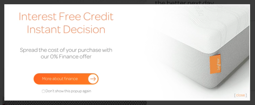
- The interest free credit popup – When visiting the site, you get presented with an interest free credit popup/opt in form right at the start. I’ve mentioned before my dislike for popups (they do polarise people!) and I feel that when you have a potentially intrusive pop up appear so early on, it comes across as forced selling which is not good. Bounce rate would very likely improve if instead of showing the popup, the user could get to and connect with the site in those crucial initial few seconds you have to grab their attention. Also there’s the Buffer software plugin issue that prevented me from closing the popup. It would stop anyone else running the same plugin from closing the banner in the usual (expected) way, by clicking the cross in the corner and people don’t like it when things don’t react as they expect. Although this could be a fringe case and can be got around by clicking on the ‘don’t show this popup again’ box, it would provide a better and smoother user experience if this wasn’t the case.
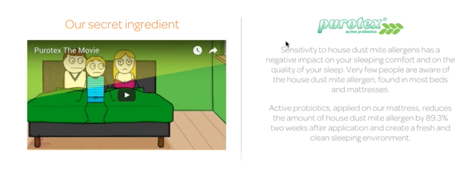
- Videos – There are 2 videos on the home page, in principle that’s good! Videos are known to aid conversion. In practise though, although people are engaged by videos, they have to both fit seamlessly into story you tell you users on the page and instill trust. The Purotex video that illustrates how if you’re allergic to dustmites Brighter can still cater to you does show a benefit, but I wonder just how much of a benefit vs the prime real estate it takes up on the page. I think it could go elsewhere. Also, the video screen grab doesn’t look happy and positive as it shows people looking sad and ill and there is too much additional text accompanying it. I would remove the video and give better UX by replacing it with more benefits provided by the product. The second testimonial video just misses the mark for me too. When I watch it, it makes me wonder how the competition are tackling testimonial videos. It feels fake, the people seem like actors trying not to act. The voice over is dated too. I would re-edit the video to make it more clear that it is acted and take the opportunity to make it more fun and engaging. The video as it is doesn’t help me want to buy the product. The “Your Stories” text makes it seem as though the review would be real but as it isn’t, that disparity erodes trust and decreases my will to buy the product. It might be a good idea to A/B test with and without video.
- Page layout – There are best practises (rooted in psychology) to adhere to when structuring content to ensure users are kept happy and are therefore most likely to convert. First, state the main value proposition. Then show social proof. Now articulate the problem (this is currently missing, in this case things like ‘can’t sleep?’ or ‘is your bed causing you back pain?’ etc.) Next comes the need to extrapolate on the problem – make it relatable, tell people why they’ll be worse off without your product. Then you need to solve the problem for them – next day delivery, feel happier, experience less back pain, 10 year guarantee etc. Now prove that your solution is the one for the user, this is where TrustPilot and reviews come in and where you can prove everything you have said above is fact. Then alleviate any worries and counter any potential objections (‘what if I’m not happy’ etc.) Where possible, counter any objections or answer any potential questions even before the user thinks of them! Pre-empt what the user might want for a better experience. Now, ask for what you want as a business, in this case, ask the user to shop now, buy this mattress etc. Finally, repeat the tagline (benefit + time + counter objection) at the bottom of the page.

- Tailor content to audience – It is important to really make sure that content is angled towards a specific audience. I have spoken before about how the casting the net wide approach is almost never effective. Creating user persona(s) then means it is possible to accurately tailor content and tone to be the most effective it can be for your target market. Towards the bottom of the page, the text is better, it is relatable and emotional – ‘snug and utterly content’… who doesn’t want that?! The text here is friendly and welcoming. In my opinion, the whole site needs to be like this if thats your angle and what your going for. It is the first part of site that isn’t quite so clinical and I think it provides a better user experience.
- Humanise the brand through imagery – The images on the site are great quality but quite impersonal, they seem cold. People may have trouble connecting, relating to and detecting the feeling and emotions behind the product (the happy, comfy aspect.) People really must be able to relate and so the images should be more about showing the benefits to people, or showing people getting enjoyment from the product over showcasing features.
Top 5 quick wins:

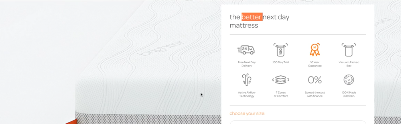
- Improve weak tagline – “The better next day mattress” tagline could be improved upon by using formula to create text that will really resonate with the user: Benefit + Time + Counter objection.
- Balance banner at the top of the page – To me, the banner seems off balance being over to the right, I would move the CTA over to the left and make it bigger and also then shrink the depth of the right hand banner.
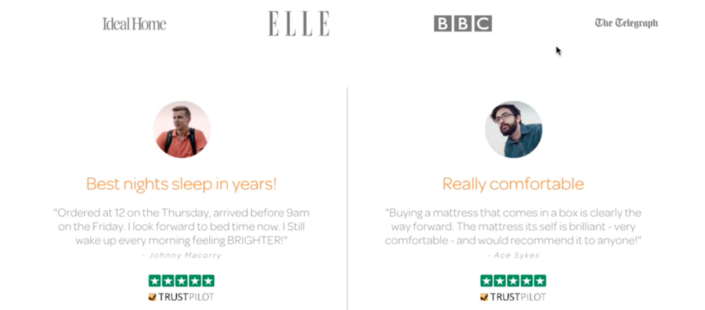
- Show social proof above the fold – Social proof is what people will instinctively look for after seeing the main value proposition. I can see that brighter have been featured in Ideal Homes and have got great TrustPilot testimonials but have to scroll to get there.
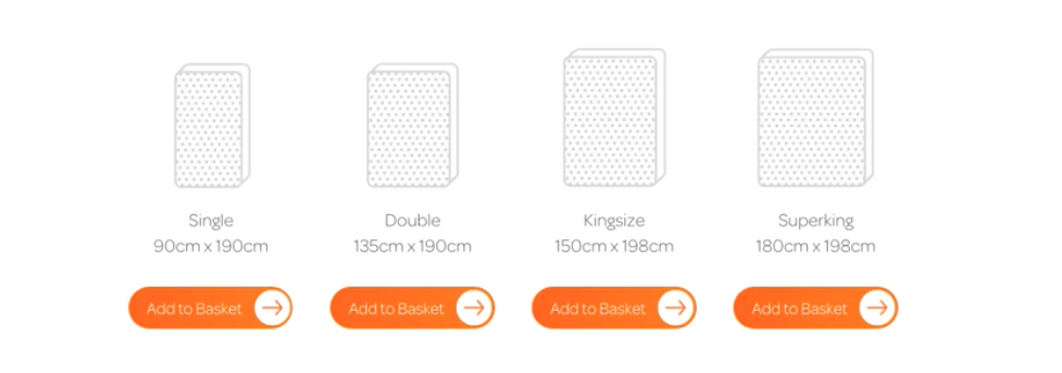
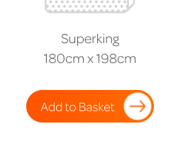
- Help people choose more easily – The mattress size icons perhaps should be clickable and I would suggest including a box to surround and highlight the most commonly chosen option. Anything that helps people make choices more easily is good user experience.
- Tweak button text – Tweaking button text and including a hover state, then testing the effects of both can help improve conversion.
Summary:
As said above, I think Brighter have been doing a lot of things really well but small tweaks and changes can make a big difference to a user’s experience! Depending how much traffic Brighter get would then dictate how to proceed with amends. If site traffic is low, it would probably be best to do a batch of amends and then monitor results relating to key changes. If there is high volumes of traffic, A/B testing is probably the way to go to gauge and explore the success of amends.

SketchDown UX/UI design video
Play the video to learn how to increase your page conversion with UX and design...