Be confident & direct for a better UX
So I’m back with the next post in my UX basics series. Here’s where I cover best practises, tips and tricks for improving online user experience and hopefully give you a better understanding of the subject and how it can bring huge benefits to your business and/or product.
Having already discussed how limiting choice can improve UX and ways to approach the minefield that is online forms, this week I’m writing about how adopting a direct tone and approach can make all the difference when aiming to better a user’s experience and increase conversion rates.
Perhaps it’s an English thing, but being in the UK, people are often polite to a fault, afraid to ask for what they want for fear of coming off rude or pushy or inconsiderate or dun, dun, dun… all three!
Beating around the bush, dancing around the matter and generally not getting to the point is rarely helpful! The person asking for what they want in a roundabout way is less likely to get it and the person being asked to take action is less likely to understand what the hell the first person is going on about or wants them to do!
Fictional (read “real world inspired!”) example:
Wife: I’m thirsty (Subtext… make me tea!)
Me: Me too (Acknowledgement and agreement – seems like that’s what’s required as a response in this situation.)
Wife: Can you put the kettle on? (Subtext… make me tea!)
Me: Sure when I’m finished with X,Y or Z (Direct and simple request, I get what’s required and I’m happy to oblige)
I put the kettle on, come back and pick up where I left off with whatever I was up to….
Wife: Did you not make tea?
Me: …err… I put the kettle on like you asked? *confused face*
Wife: I thought you were making tea?
Me: You didn’t ask me to make tea? Why didn’t you just say so?!
…I go to make tea…
But, she is my wife, I’m happy to make tea and I have the time to have this kind of to and fro if she’s not explicitly clear in the first place!
But anyway… The thing is you don’t have that luxury when we’re talking interactions between you and your potential paying customers or users. We know that you only have a very finite amount of time to get a prospect onboard and convert them (5 seconds in fact – read more in my previous post about it here.) In this case, waffle is the enemy and rambling is not an option – it’ll cost you time, money and conversions.
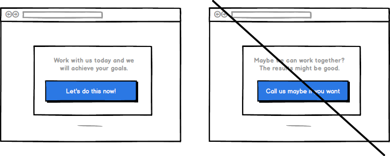
Now I’m not saying that you need to get right up in your prospects face and demand they take action immediately when they come across your offering, that’s too hasty. There’s definitely a happy medium and effective middle ground for you to tread to get results, but I can assure you, providing a better user experience through adopting a more direct approach will benefit both you and your prospects.
Benefits of being direct:
Improve conversion
Grab Your user’s attention faster and more effectively. Being more succinct means less text for you to write (bonus!) and It’ll take a prospect less time to read giving you more opportunity to hammer your core messages home in those all important first few seconds.
If you want your prospect to take action (and obviously you do!) Communicate with them in an active conversational tone. Give your content some oomph! Use storytelling grab their attention and retain it, don’t make your prospect yawn!
You need to be direct through your use of content. You should aim to provide enough, active and optimised copy that allows you to explain the benefits of your offering fully, not just harp on about the features (read the “Craft content that sells around a structure” section of this post.) At ALL COSTS avoid giving your prospect information overload by providing too much or superfluous information, this will resulting in choice paralysis – a huge conversion killer.
It’s important to always remember, you’ll be very familiar with what you’re offering, a prospect won’t be. Clarity is crucial. Make everything super obvious, give clear and precise instruction to ensure that what you’re actually asking of the user is as obvious as you think and you’ll see conversions rise.
Reduce bounce rate
Being concise should also naturally lead to there being enough white space on your page. Giving your key messages room to breath is an important factor in reducing cognitive load on your users and as a byproduct reducing bounce rates – hooray!
There’s even more you can do to make your product and messaging more digestible and less taxing for your prospect to wade through too. Make sure you use the appropriate words and language, try to be laser precise and to the point and your users are more likely to stick around.
Whilst we’re on the subject of less being more, get rid of any “fluff.” Doing away with anything unnecessary on the page whether that’s content or fancy design elements gives clarity. When you limit choice (check out my previous post on the topic) a user’s path is clearer, there’s less cognitive load, bounce rates are likely to shrink.
Instill trust
An authoritative and trustworthy tone instills trust. I’m going to assume that your product or service is awesome. It is useful and valuable thing that people want and it would benefit them to have it – great! Don’t do yourself a disservice and ask your prospect if they “might be interested?” Or suggest that they “perhaps want a trial” or “maybe want to sign up.” If you don’t sound sure, aren’t certain of yourself or offering, you can’t expect them to be! Once that seed of doubt is planted, it’s very hard to eradicate. You don’t get a do-over on first impressions.
Inspire action
Online, people respond best to an active tone. It often seems less corporate and cold and can be read as if it has a spring in it’s step.
Try inducting elements of storytelling whilst making your concise, active copy conversational too and you’ll be onto a winner and on the way to creating a superior user experience. Your users will understand your message, be sold on your offering and be inspired to take action – woop woop! They’ll also have had a great experience along the way, be more likely to remain a customer for longer and share your product or service with others, can’t ask for more than that!
Guide your prospect and spur them into action. Tell them in a direct, active and conversational tone what to do next or what you want them to do, “sign up here,” “buy it now” “get the whitepaper” etc. If you don’t ask, you don’t get!
Takeaways
Communicate in a direct, active and conversational voice, be concise, and don’t overloading your prospects. Making sure you instill trust and inspire action too and you’ve got a winning formula… It seems so obvious when you stop to think about it. 🙂
It’s important to say that no one gets everything right first time and crafting great user experiences is at it’s heart an ongoing and iterative process. Make a change, asses the results, plan further action based on your data, rinse and repeat. It’s a long game, but have a bit of faith in yourself and your product and you can do it! Come across confident, cut to the chase, improve your user’s experience and reap the rewards of a more direct approach.
Increase your conversion with expert UX and UI design.
Try me! Get your free one page UX & UI video audit now. 1 free audit left this month.

Increase conversions with a single column landing page format
If you want to learn how a one column landing page layout can improve your conversion...