Increase conversions with a single column landing page format
If you want to learn how a one column landing page layout can improve your conversion rates, you’ve come to the right place.
…and don’t worry, after the accidental essay that was my last UX basics post Improve UX & conversion. Ditch the drop down, this time I’m going to try and keep it short and sweet. 🙂
Many websites look pretty similar, image at the top, 3 columns beneath…why is that?
- Not trying to break the design mould every time *should* give you more time and money to spend on user research, content, testing and all that other good stuff.
- Following on from that, it has become the norm. It’s simple and clean. People are comfortable with this layout and standardised design is good for UX.
A lot of designers still tackle landing page design in the same way that they would website design for those very reasons.
But do you ever wonder if there could be a better way?
Pages within your website no doubt have many roles to play;
- Providing further information about your offering.
- Rounding out the users opinion of your business.
- Answering in depth questions about your product or service etc.
- Providing a way to get in touch with you.
But your landing page has one mission, one goal and that’s to convert your prospect.
It stands to reason then, that it should be treated differently to other pages on your site.
Your landing page should solely be centered around;
- Receiving traffic.
- Channelling your visitor down the page.
- Providing them with engaging and persuasive content.
- Encouraging them to take a defined action at the end.
So you need to remove as much distraction as possible. Streamline the experience and guide the viewer smoothly down the page.
I’ve written (at length!) about many of the varied techniques that you can employ to increase or boost conversion on your landing pages in my mini series “Secrets behind the best converting landing pages revealed”
As an incredibly brief and much abridged refresher for the purposes of this post…
– Remove navigation items (or at the very least downplay them!) Keep users focussed.
– Tell a story. Keep it short but take the user on a journey through the page. Storytelling is a great way to keep people engaged right until when you want them to take action.
– Hit them with a call to action phrased in such a way that they can’t fail but to convert when they get to the bottom.
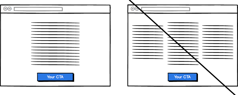
A one column landing page format can be a really effective way of incorporating these points into your landing page.
One column landing pages also have the following benefits…
- A one column format looks cleaner, it tends to have more white space, which as we know makes things easier for your user to digest.
- Research has shown that one column of text and images offers less distractions. Less distraction = less cognitive load = improved user experience.
- Using a one column format forces you to be really choosy about what you include on your page, which has the added benefit of often making your copy more concise which provides a better user experience.
- A single column draws the user’s eye down the page. With two (or more!) columns your users are incredibly likely to just skip large parts of the text.
- One column layouts improve understanding and keep your users engaged, they lead your viewer down the page in the direction of your all important conversion.
- Unsurprisingly therefore, studies have been able to show that single column landing pages have the best rates of conversion. – What more reason do you need?!
Many landing pages still use a multi column ‘show ‘em a bit of everything’ approach combined with an ‘I’ll stick with what I know’ strategy and wonder why conversions are lagging.
But to give your users a great experience, you have to keep up with UX trends and developments and be open to change and trying something new once in awhile. 🙂
Chances are that you could see significant improvements in your conversion rates utilising a single column landing page format.
But don’t just take my word for it, if you want to find out if a one column landing page layout is right for your business or product, get on and test it.
Go on, give it a go!
Increase your conversion with expert UX and UI design.
Try me! Get your free one page UX & UI video audit now. 1 free audit left this month.

Improve UX & conversion. Ditch the drop down
Drop down menus get a lot of bad press. They’re generally disliked and commonly...