Improve UX & conversion. Ditch the drop down
Drop down menus get a lot of bad press.
They’re generally disliked and commonly referenced as being past it, over the hill, no longer relevant and bad for UX…
Drop down menus come in at No1 on the list of design elements whose time has come at UXMag … and that was a whole 3 years ago! Eeek!
There are many, (many!) really interesting and relevant points made by Eric Campbell and Golden Krishna over at fuckdropdowns.com and I’m pretty sure I don’t need to give you any clue as to how they feel about the using drop down menus!
You’ll commonly see drop down menus used in these scenarios.
- Forms – You’ll come across this every day, often multiple times a day in the selection of shipping addresses, dialling codes, country of residence, billing/credit card details, number of items in your basket, the list goes on…
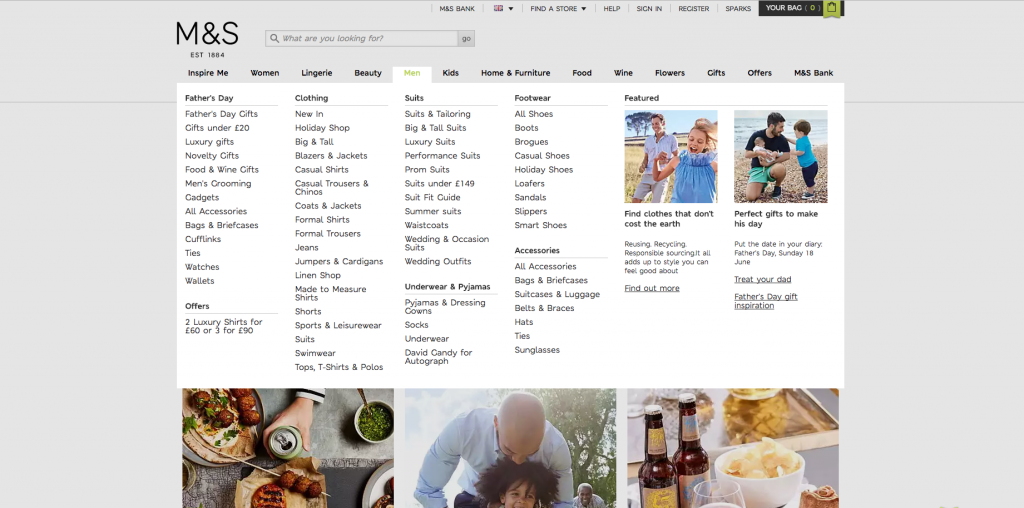
- Navigation menus – Again likely something you see daily, website’s often employ drop down menus to show you a list of subcategories or further options underneath the main menu items and to direct you to elsewhere within a site or app.
So why are they bad if they’re so commonly used?
I think the key is in the title there, drop downs are bad because they are so commonly used.
They’re a go to, no thought needed. They’re perceived as a safe bet to use in any scenario, when actually, you need to consider how they impact on your user’s experience, after all, there’s more than one way to peel an orange!
Often there’s a far more appropriate way of acquiring information that is much less labour intensive on your user in the case of forms. And there’s definitely a better way of crafting site or app navigation than displaying a menu that then hides lots of sub options nested below the initial usually overcrowded menu.
Drop downs can result in a poor user experience because…
- They can be confusing – Don’t assume that just because they’ve become the norm that everyone’s going to know how to interact with them.
- They hide information – This information once located then has to be sorted through in the user’s mind. This goes against the mantra “don’t make me think.”
- They often necessitate multiple actions to be taken by the user – If you come up against a date input as a drop down, you’ll need to select a date, scroll down some way if it’s not a date in the first week of the month and click, then scroll to find and select a month AND do it all over again for the year… There’s a lot of room for improving UX here!
- They confront users with too many options. – I’ve written a whole post about how limiting choice is important for a good user experience, too many options often lead to possibility paralysis.
- They don’t work well on mobile – having multiple drop downs is just fiddly and time consuming on today’s smaller screens.
- They’re bad for accessibility – For someone with poor visibility or perhaps reduced motor skills, drop downs present a serious barrier and frustrating experience.
- They can affect SEO – With usability playing more and more of a factor in SEO, you can see how drop down menus can have a detrimental effect.
- They just plain annoying – Well… sorry, not sorry! They are!
What can you use instead of drop downs?
What you can or should use in place of a drop down is largely determined by what the use case is. Here are 6 options that you can implement in place of drop down lists within forms to improve upon your UX:
1. Radio buttons – Google tells us that a radio button is an “icon representing one of a set of options, only one of which can be selected at any time.”
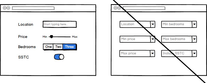
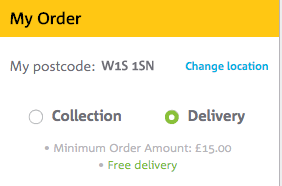
You can use radio buttons or radio groups for easy selection yes/no type options, or for when a user might have choose between a small number of options.
All of those options will be immediately visible for the user to easily choose between with only one action, a click or a tap.
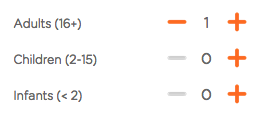
2. Steppers – You can use steppers to change a value, by increasing or decreasing that value by a predetermined amount.
Instead of a drop down prompting you to have to scroll through a list of numbers, if you think I’ll get so ‘n’ so’s ticket at the same time, you can do so by just clicking that plus sign and adding another person onto your travel itinerary.
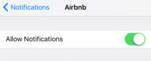
3. Switch – If there are only two options available to the user for any reason, you should definitely consider using a switch and if you do, also consider pre-selecting the most commonly selected option.
This means that yes, some people will have to take one action to choose the alternate selection, but most won’t, and neither will have to click on a drop down to then see two options and move the mouse or their finger to select it.
4. Slider – Filtering by price is a good example of when you can use a slider instead of drop downs. Sliders allow you to choose from values within a predetermined range.
5. Buttons – You can use buttons to easily show options that otherwise would be hidden within a drop down.
This again reduces the action needed on the viewer’s part and optimises their experience; the options are clear, they make a single tap or click and they can move along. (As supposed to the multiple actions needed in clicking the drop down, scrolling with the mouse or their eyes to the appropriate option and clicking/tapping that)
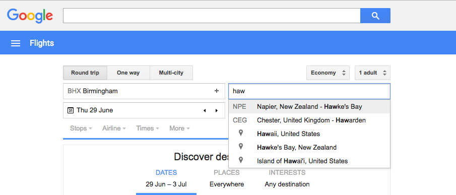
6. Auto-fill – In the case of for example choosing a country for shipping, there can often be a seemingly infinite number of options to choose from if there is a drop down as a method of selection.
This is often complicated by the fact that not all lists of countries are standardised and shown in the same order; some are alphabetical, some are listed in terms of ‘popularity,’ others are (infuriatingly) seemingly random!
In instances such as these where you might have 20-100+ options it’s advisable to think about implementing a text field with functionality that allows for auto-filling to negate the need to click any drop down then scroll for days before making a selection.
Now, when it comes to navigation that’s obviously a different kettle of fish all together! Here are a couple of ways that you can display menus that don’t include drop downs:
1. Sticky menu – Sticky menus make navigation really simple. Simple is usable – great!
Sticky menus are so called because when you scroll down the page, the menu bar sticks to a given part of the screen (usually at the top) instead of disappearing out of sight..
It means that navigating the site is always going to be a breeze, you don’t have to go and locate how to navigate or where you want to navigate to because wherever you are on the page, the menu is right there with you!
I’m a big fan of sticky menus, there aren’t many more simple and user friendly ways of presenting navigation.
2. Scroll Panel – Scrolling is really accessible. It is less labour intensive than having to click to go somewhere and users are very tolerant of scrolling. (That’s one of the reasons for the titanic rise of the longform landing page.)
You just don’t’ have to squash every potentially relevant piece of information above the fold on the page your prospect lands on.
Utilising a scroll panel design gives you space to create an impactful design and utilise large, striking imagery.
You just have to be sure to clearly segregate different panels as make it obvious to your user where they’ll be taken if they click on that panel. Remember swanky design isn’t enough, your site needs to provide a great experience and for that, you need to let the user know at at all times what’s going to happen next.
You can always sneak a site map style menu in the footer for those users that might be of a more traditional disposition, remember you need to make you offering accessible for all of your users.
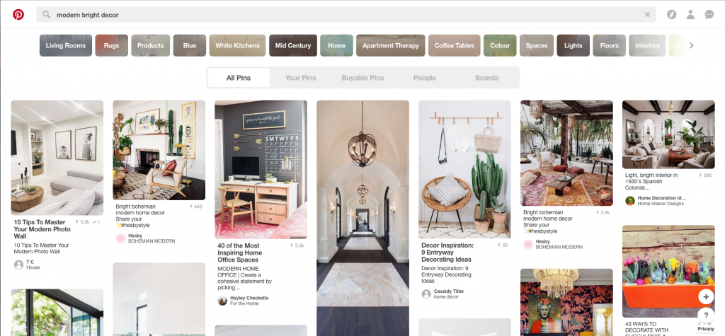
3. Card style – Now card style navigation can go either way so tread carefully with this one!
On the one hand you can create a very visual, logical, and enjoyable user experience by keeping things simple and intuitive… Or design can overrule function and things can quickly get complex and convoluted.
Don’t confuse your users with lots of colours or fancy animations. You need to ensure that if you employ a card style navigation that users can truly easily navigate your site with ease.
Ok, so having covered off on why drop down menus and navigation can be problematic and what you can use instead, there are going to be instances where they seem pretty unavoidable – there’s always exceptions to the rule!
There are some reasons people might be pro drop down:
- They only permit the selection of ‘legal’ choices (Forms)
- They save screen space on desktop (Navigation)
So here are some best practises to take note of if you do need to use a drop down:
Avoid interacting menus – When you have multiple menus, if they interact with one another they can really throw a user off.
A good example is within iTunes – the options that you are presented within a drop down when you select “view” and you are also in your “library” differ from the options that you see when selecting “view” when you are on “for you” music tab.
Don’t hide key navigation in drop downs – If you obscure top level navigation by tucking things away in drop downs, you’re going to have problems.
Again, you want key things immediately available for the viewer to see, don’t make them go hunting. Give your users a poor experience and they’ll just give in and go elsewhere.
Avoid drop downs for things people can complete fast on auto-pilot – I’m talking things like date of birth here.
You know it without having to think. That’s a quick and easy one to fill in… unless it isn’t and you have the dreaded three stage drop down, one for the day, month AND year!!
I mean why?! Do you hate your users?!
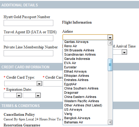
Avoid really long drop downs – If a user clicks on a drop down and it falls off the bottom of the screen, they have the carefully scroll down to be able to see all the options available to them. That’s sometimes quite tricky resulting in the mouse falling off the side of the drop down and the user needing to go through the process again which is obviously infuriating. Not good UX at all!
Try to have all options visible to the viewer from the start, it’s less taxing to try and make a selection, even if the list is a little long, if you can at least see everything to begin with.
Ensure you drop down label remains visible – You’ve clicked on a drop down, and for a second your mind wanders. You suddenly remember you forgot to text your Mum? Or perhaps you start thinking what’s for dinner…
Anyway back to the task at hand. Erm…the drop down no longer makes sense, you’ve forgotten exactly what you were doing, and there’s no label to provide context about the option you need to select.
Annoying and unnecessary. The inclusion of a label is such a simple thing and it can make a big difference to the users experience.
Avoid drop downs if typing could be quicker – Back to the list of countries scenario, it is clearly much simpler and vastly preferable to just type France or UK into a field than contend with a massive, long, often strangely organised list.
Support keyboard input – Your users should be able to use the keyboard as well as a mouse to aid in making a selection from a drop down.
Make it so that your users can use the arrow keys to navigate up and down the list to the thing they want to select.
Likewise, if a user starts typing, that should navigate them to options beginning with that letter or letters, making the list of options shorter, speeding up the scrolling process and reducing cognitive load, hooray!
Conclusion…
Every drop down that you use, hides choices that you need the user make.
Most drop downs also obscure a number of actions that you need the user to take, to make those choices.
If options that are hidden are integral to conversion or the user flow through your website or product, that’ll be causing friction, frustration and drop off… You’re going to want to address that and fast!
Ask yourself, is a drop down the best way to gather information, are you making it easy for your users? Or does a drop down provide the best navigation experience?
All the alternatives listed above doesn’t mean that you should never go down the drop down route. The best forms, those designed with optimum user experience in mind utilise the right tool/input for the questions that they need the user to answer.
There will no doubt be times when you do need to employ the use of a drop down or two, but I strongly recommend that a good amount of thought is given to those too and you factor in the best practice suggestions above – not all drop downs are created equal!
You should always be objective and I guess what I’m trying to get across is that a drop down should usually be your last port of call.
Try to minimise what you’re asking your user to provide and how many steps they need to take to get to where they want to go as much as practically possible. Then ensure the use of smart solutions that minimise cognitive load on the user – you owe it to them!
Mass appeal is a myth! Be niche for better UX
If you want to uncover how to make friends with UX and learn how to harness it to...

