SketchDown UX/UI design video
Play the video to learn how to increase your page conversion with UX and design thinking.
Time for something new. This is the 1st in my series of SketchDown UX videos I plan to share with you guys. Its an idea I’ve been thinking on for a while now, and I hope you like it. So what’s a SketchDown and how can it help you?
As a UX designer, I do A LOT of explaining; why your menu should do X to help users, why your content should do Y to resonate, why your product should do Z to increase conversion. A lot of this explaining comes in the form of consultancy, UX audits, user testing videos and hands-on UI design work.
These methods are good at getting across the product/page strengths, weaknesses and what to focus on now for the greatest increase in conversion and therefore revenue for the client… However I want to offer something more, I want to show you the UX design thinking and the actual UI design work as it happens. To highlight the thinking, but also how key, how important UX and UI design is to every product!
We will start with an existing product or page and look to fix any key issues fast. This isn’t a pixel-perfect design lesson, nor is it training you how to use photoshop to create a developer ready design. It’s a quick, rough, design review using a flat jpeg screen grab, using UX best practice and hands-on design work to SEE results fast.
This video includes:
- A mini UX teardown.
- Rough wireframing session.
- And a fast paced design session.
- All mixed together to produce a quick but improved prototype.
- Aimed at increasing page conversion.
I’ve coined this process a ‘SketchDown’ as it’s more than just a teardown but not as involved or detailed as full on UI design work.
In this 1st session we will learn:
- How to grab your user fast, by crafting taglines that work.
- How to increase trust with social proof on any design.
- How and why to minimise menu items for increased focus.
- How to increase conversion by focusing on 1-page goal.
- How to create buttons that beg to be clicked.
- How to increase conversion with a lead magnet.
- How to keep the user happy by simplifying a busy page.
- How to increase conversion by making sure your unique value proposition is shining through.
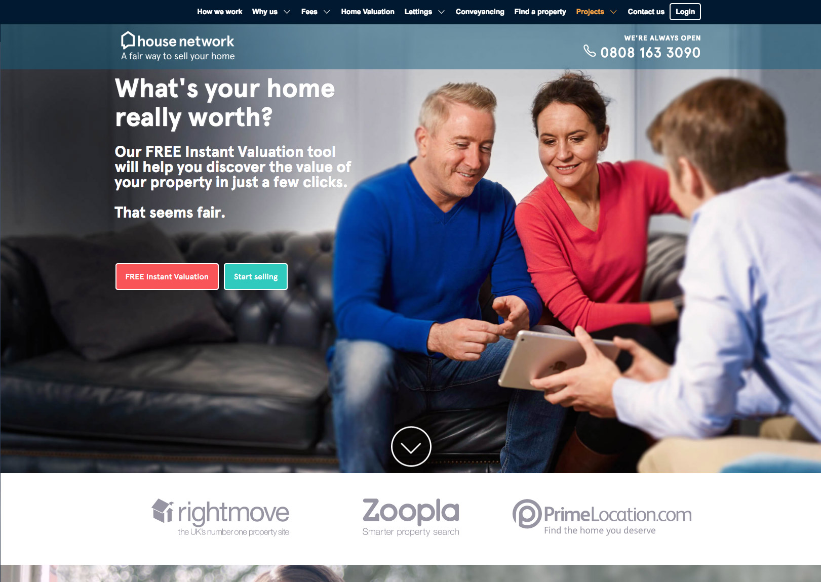
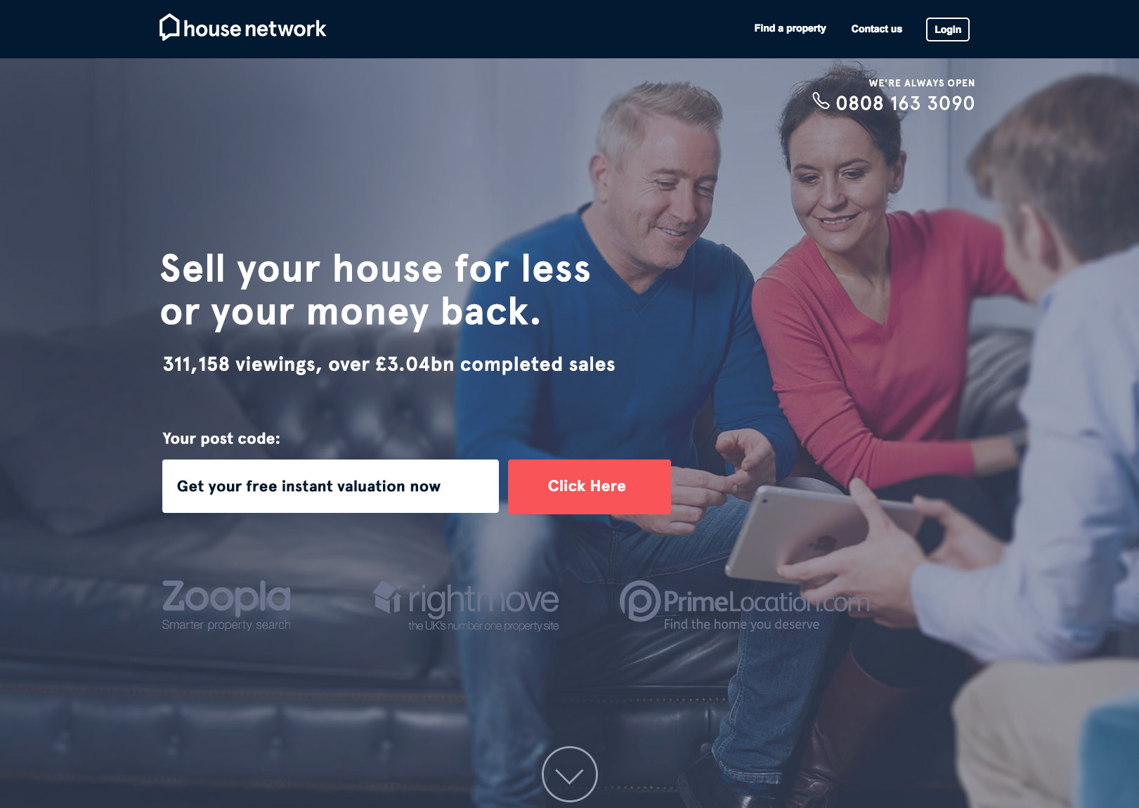
This 1st video is around 40 minutes long. If you want to see the end results look below, there you will see a before and after shot, but I urge you to watch the video to learn HOW and WHY we got from A to B.
So let’s get to it!
In this video we will be looking at www.housenetwork.co.uk. The house network is a new breed of self-sell estate agent, enabling the seller to cut out the high fees high street estate agents charge which seems like a great idea to me! I’m just about to sell my house and wanted to look into alternative methods and how I could save money. Anyway, let’s get to it! I hope you enjoy the video. Please share and let me know what you thought so I can make them better in the future.
If you have any questions ask away.
Here’s the design before:
Here’s the completed SketchDown:

Do I have a UX problem?
Well, that’s a big ol’ question! The truth is that very few organisations or products...