Improve UX & conversion rates with form design best practises
This is the first in a series of posts that I’ll be creating that explore basic best practises for online UX. As time goes on, we’ll cover a number of different topics and principles which if applied will set you on a path to creating the best possible user experience… Let’s get started!
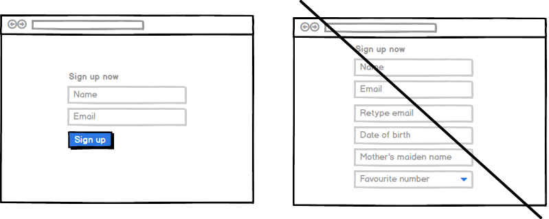
It has become a rule of thumb that less form fields is better UX. After all less hoops for the prospect to jump through means less friction. People don’t like resistance so it makes sense that removing as many obstacles as possible should increase conversion.
There have been several studies on the subject over the years (although not much recently,) and here are some figures for you to mull over…
- ImageScape found reducing the number of fields in its contact form 11 to 4 increased its conversion rate by 120%.
- Formstack found that reducing the number of form fields to 10 or less increased conversions by 120% and reducing the number of form fields to 4 or less increased conversions by 160% Even reducing the number of form fields from 4 to 3 increased conversion rates by 50%! According to this infographic, there’s absolutely no doubt that you can expect vastly improved conversion rates when you reduce the number of form fields.
So this sounds awesome, who doesn’t want an increase in conversion of up to 160%? Quick! Strike off as many form fields as you can why don’t you! …not so fast!
There are several things to be aware of before you start cutting fields from your forms. It is a general rule that less form fields leads to more conversions, but there are exceptions to every rule and so it stands to reason that there are actually instances where the reverse is true.
Things to watch out for…
– Don’t go removing the more engaging aspects of your forms otherwise even though there’s less to fill in, your conversions will take a dive!
– In some cases, more (I’m talking 8-10 not 30!) form fields will also yield higher conversion rates. This is business and context dependant. i.e. if for what the user needs or wants to do, they have an expectation of being met by a lengthy form, it won’t be as much of a barrier to them. Similarly, if the value of the offer or reward for filling in the form is high enough for it to still be a no brainer, conversions won’t suffer so much. Let me make it clear though, be objective here. Is what you’re offering really worth those 9 form fields? Don’t use this as an excuse not to be picky about what info you require from your prospect.
Having established that yes, even factoring in the warnings above you most likely should use fewer form fields to improve UX and boost conversion, the next thing to consider is does your business need quantity or quality of leads? The answer to this is important because obviously having shorter form is easier on the user and will result in higher conversion rates but will it result in better quality leads? – not necessarily! You will no doubt need to strike a balance between quantity and quality.
So what next? Run some tests that’s what 🙂
You need to determine what the optimum number of forms fields is for you to bring in the right number and quality of leads for your business and whether longer or shorter forms actually work better for you in practise.
- Aside from just reducing the number of form fields, here are some tips and things to test out to improve your user’s experience and your conversion rates:
- Highlight the prospects current field clearly.
- Set your form out logically and simply (and keep things nice and straight – don’t get fancy with forms, intuitive is what you’re aiming for.)
- If shorter forms are the way you have found you need to go, get better at asking higher value questions to get the most from your prospect in the smaller number of fields you have.
- But closely look at each field and try to identify and minimise any potential stumbling blocks. You can always change or revise the copy to minimise friction.
- Optional fields can be a great way to obtain extra info. Try experimenting with your mandatory and optional fields.
- Clearly differentiate required and optional fields.
- If your form is on the longer side, try inducting a progress bar to visually indicate to your prospect they’re making headway.
- Also, how much space your form occupies on the page can be as discouraging as a form with many, many fields.
- Make your forms touch friendly and even more importantly responsive.
- Be flexible and accommodating. If your users have to register, why not let them use an existing social account? Easier process and better experience for them, more insight for you!
- Test external form field labels vs placeholder text/inline labels (or try a combination of both!) as dependant on the information you’re requesting, placeholder text alone can subject your users to unnecessary brain strain!
To round off, forms are a necessary but let’s face it, people avoid labour intensive tasks and no one loves trudging through endless fields. Each and every form field represents friction and an obstacle that could mean your prospect is more likely to take the path of least resistance and just navigate away. When using forms, it is vitally important to strike a balance. You need to make things easy for your prospect and ask as little from them as possible to improve conversion rates, whilst also gaining as much information and insight as you need to be beneficial for your business… well no one said it was easy! 🙂
Find out more about my UX services here, I’d love to help you so get in touch!

My Top 10 UX Hotfixes on Optimizely
Check out my latest article featured on the Optimizely blog. The piece was called :...