Create better user experiences by limiting choice
So, I’m back for the next instalment of UX basics! If you’re new to the concept of UX, or just want to get a handle on some strong basic principles to start laying the footings for creating great user experiences then you are in the right place.
Choice is great isn’t it? Being free to choose feels good!
I like options (and I’d wager that you do too!) the more the better 😀
… That is until I need to actually make a decision to buy that product or commit to that plan, then suddenly all those choices seem overwhelming, mind boggling even. I can’t decide, I’m overloaded, I think I’ll mull it over later but I won’t ever quite get round to it.
Dun dun dun… Possibility paralysis! The paradox of choice.
This is a well documented and studied phenomena. Pretty much all research points to people wanting endless choice but not being able to cope with it when they are given such freedom. Yet product owners and service providers still can’t resist the urge to give prospects ALL OF THE OPTIONS (because, secretly it’s what they’d want really! It’s an unfortunate vicious cycle.)
There’s a go to study to illustrate the paradox of choice in simple terms which was carried out by Professor Sheena Lyengar and written about in her book The Art of Choosing. Here’s a rundown of some of the findings:
- When shoppers were given the choice of sampling 24 different flavours of jam, 3% of them made a purchase.
- When shoppers were faced with only 6 sample jam flavours, 30% then bought.
- The sampling station with more choice attracted more attention but…
- The sampling station with less options resulted in more sales.
- 75% less choice resulted in 10 times more purchases.
- This indicates too much choice is bad UX, that it is actually detrimental to decision making and is often the cause of thought and action paralysis and reduced conversion rates.
So what can you do to stop your prospects getting overloaded and encourage swift easy decision making?
- The best and simplest solution is to limit choice. I can’t stress this enough! Limit your prospects options to improve user experience and you will without doubt be less likely to overwhelm them.
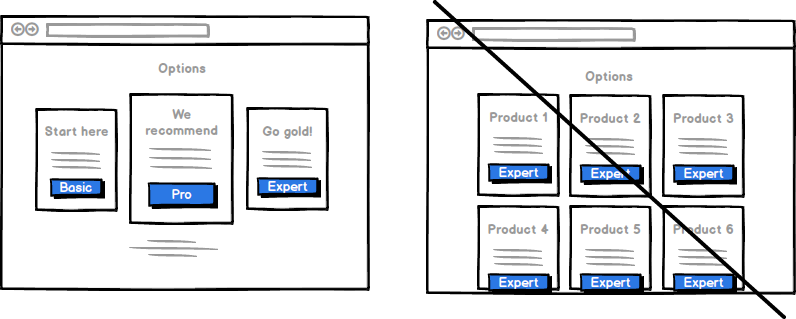
- If you do have several (hopefully very well thought out) options or pricing tiers, ensure that you clearly differentiate them. Avoid confusing overlap by making different options clearly defined and state what the prospect will be getting when they make a purchase with abundant clarity to raise conversions.
- Obviously clean and clear user centred design has a large part to play, making sure you adhere to design best practises is a crucial. Let the user’s subconscious and proven principles of psychology do the hard work for you. Don’t try and reinvent the wheel with how you display your offering. Intuitive is the aim of the game and if things aren’t displayed as the user expects them to be you’re providing unnecessary barriers to conversion.
- Make suggestions or direct users towards a particular course of action or package to reduce cognitive load. This can be in the form of a “preferred plan” or “most popular” package. Differentiate and highlight it with colour to draw the prospects attention. Directing the user towards a best course of action can also be in the form of a special offer or an incentive… cue point 5!
- You can always improve user experience and sweeten the deal with something like get the first month free or having an accessible pay monthly option. (Before you ask, yes I do see the irony in suggesting inducting an additional option!)
- Pricing needs to be upfront and obvious. Nothing undermines trust (a vital cog in the user experience wheel!) like having to go hunting for the cost of the the product or service that you’re interested in purchasing.
- Ensure you have a clear and obvious CTA …I mean that should go without saying but I’m going to say it anyway!
- Basically just do anything you can to reduce the load on the user 🙂
There are many areas where these principles are applicable, (not just in a tiered product pricing table for example.) You want to steer away from too many services, too much product choice, too many conflicting offers and too many social share options. This is the case on your website or app, in your marketing emails, ads or popups, the list goes on… When presented with too much choice, people can’t make a decision. That means they can’t choose your offering, they don’t get what they need and neither do you – it’s lose, lose. I can’t off the top of my head think of a scenario where more choice is better! More is actually less. 🙂
I want to help you learn about and harness tactics that will increase your conversion. If you want to reap the rewards that giving your users a great experience will bring, check out my UX audit service page and get in touch today.

Improve UX & conversion rates with form design best practises
This is the first in a series of posts that I’ll be creating that explore basic...